Heyo. I’m looking for feedback on a set of sprites I’m working on currently.
Here’s an example of it opening: 
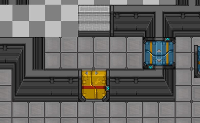
Inset in walls: 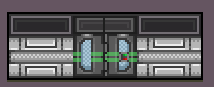
And finally, I’d like to know which of these looks better:
A) 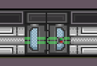
B) 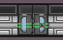
- A
- B
0 voters
Thanks!
Heyo. I’m looking for feedback on a set of sprites I’m working on currently.
Here’s an example of it opening:
Inset in walls:
And finally, I’d like to know which of these looks better:
A)
B)
0 voters
Thanks!
B looks more like it’s opened by sinking into the floor instead of sliding into the walls.
A looks much more like it fits, slightly thinner than the walls itself to fit.
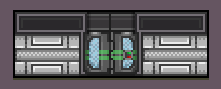
Nice. I think a little bit more detail on the top of the doors would be good, or perhaps a darker colour, as I think they lose a little bit of the perspective and look almost oblique but not quite…ish?
I think the color difference is fine, it flags it up as part of the airlock, and not part of the adjoining walls. Keeping the detail low helps it fade into the background as well.
both of these look pretty nice, but having them be the same width as a door makes them mesh a liiittle bit too much.
Lights should be below (or above) the outline, not overlap with it, wich breaks the consistency kept with the walls as well.
Adding sliders under the door was a smart move, i like it.
I would go with something akin to A, but with that light subject fixed, removing that extra squaring pixel on the opening ridge, and increasing contrast n hueshift on some colors, such as the off lights, the metal itself, and the stripes (last one being pretty important).
I would also discourage the banding that’s going on the top of the airlock, makes it look hollow.
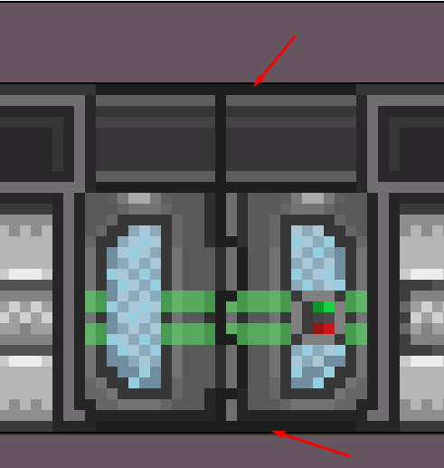
here’s an example of how yogs is handling perspective airlocks, for reference: the airlock is thinner than the wall, and they added a little frame to it to denote a more distinct difference between wall n door, wich is useful. not shown here, but the upper arrows also light up when the door opens.
You know what? I genuinely thought the walls ended when the airlock broke its line. Am idot.
Uh, the alcove at the top is to be inline with our current rwalls, which do exactly that:
Though now I know airlocks don’t break them I can sync things up more nicely.
I’ve altered it some. It now actually looks set into the wall, and there’s a transition from the walls to the airlock.
(there’s an r-glass modifier on there also which i’d like feedback on)
looks definitively better, but i would remove the extra outlines you added to finish that indepth look, (basically those black rows on the top and bottom), and make the lights not conflict with the border outlines, and should be set.